Celebrating 50 years of UK road signs
A look at how UK road signs have become design classics, and how they were created - plus our road sign quiz
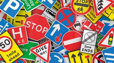
Governments like to count things. Births, deaths… and road signs. The Department for Transport carried out a roadside stock-take in 2013 and found that in England alone it had 4.57 million signs – with 10,000 new ones appearing each year.
Even at 30mph, drivers have never had so little time to absorb so much information. Were it not for a series of simple pictogram signs, which recently turned 50, we’d spend more time eyeing the signs than the road.
Upon their introduction in the sixties, the now-familiar rockfall and deer – and the road worker fighting his heavy umbrella – replaced a hotchpotch of sometimes confusing designs. A previous revamp had suffered a piecemeal rollout, and the roads of the early sixties were a patchwork of new and old icons. Schools were sometimes announced using two children crossing the road or, elsewhere, a flaming torch of knowledge. With Britain on the cusp of joining the Common Market, in which signs complied with the Geneva Convention, the Government called upon Walter Worboys, director of ICI and one-time chair of the Council for Industrial Design, to bring us in line.
• UK driving licence to display Union Flag
He took on Jock Kinneir, a tutor at Chelsea College of Art – and he brought in student Margaret Calvert to help him design the signs. Calvert says of the project: “It wasn’t a fashion thing, we were designing for permanence... something that wouldn’t look dated in five or 10 years’ time.”
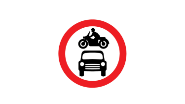
The result was a set of black-on-white icons, and while the sixties aesthetic is undeniable – check out the car and motorbike in particular – they’re largely unchanged to this day. Out went text-heavy signs on cut-to-fit panels; in came Euro-standard circles, squares and triangles, and with barely any words they made as much sense to non-native speakers as they did to Brits.
• No drink, no doubt: our drink-drive campaign
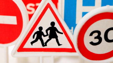
The designs were inspired by the artists’ own lives. The ‘cattle in the road’ cow was based on Patience, an animal Calvert knew from a relative’s Warwickshire farm. And the girl on the school sign is Calvert herself. “The previous sign had a boy with a book and a girl behind him, and they weren’t holding hands,” she says. “This is a bit more caring; I switched it around and I based [the girl] on me as a child.”

The designers came up with a new typeface called Transport, too, setting text-based directions in a mix of upper and lowercase. Fairly radical – but it had both cosmetic and practical benefits, as the unique shapes of mixed-case words are more easily read while driving. The eyes see the shape, the brain fills in the gaps as we motor by.
Mixed-case signs were already in use on the newly opened M1, but they weren’t universally appreciated. In the December 1960 issue of Traffic Engineering & Control, designer David Kindersley agreed they were a success, but believed this had less to do with the font than their size. Smaller signs were preferable, he said, as at night the whole sign should be within the range of dipped headlights, negating expensive illumination.
The easiest way to shrink the signs would be to stick with uppercase and do away with the ‘tails’ on, say, y, g and p. He and Kinneir even debated the change on prime-time TV – there wasn’t much on in those days – but mixed-case won out and the Transport font is now used in Iceland, Hong Kong and much of the Middle East.
Designing the signs took less than a year; rolling them out took longer. After a Commons debate in July 1964, the official switchover began on 1 January 1965, with a two-year completion target. Government-issued booklets explained the changes but, 12 months on, the new designs were still causing consternation with locals.
The pain was short-lived, though; 50 years later the signs are still in use, and in many ways they do a better job than the tweaks and additions made since. An eighties refresh introduced the elderly people sign, and was criticised for implying all pensioners needed mobility aids or ended up being disabled.
Dr Ros Altmann, the Government’s Older Workers’ Business Champion, questions why drivers need to be warned about old people as if they are a hazard. She argues that the 1981 sign is at odds with the reality of modern ageing. Despite that, it’s stuck.
Calvert, too, feels that the sign – not one of her own – was “patronising” to older people and “prissy and badly proportioned” compared to the sixties family of pictograms. But maybe it’s not only badly designed; perhaps it’s also missing the point. As Altmann says: “Someone listening to their iPod or looking at their mobile and stepping into the road is likely to be much more dangerous than a slow older person.”
That view has some support. When booking app Hailo surveyed 500 cabbies, a third said there ought to be signs marking out areas of high headphone usage, while the University of Maryland recorded a three-fold increase in the number of accidents involving headphone-wearing pedestrians in the eight years to 2012; 70 per cent of those were killed.
An iPod sign is unlikely, but changes are nonetheless afoot. The Department for Transport is set to liberalise traffic signage in March by reducing sign clutter. It hopes to retain national consistency while giving local authorities greater control over choosing the most appropriate sign for any particular circumstance.
It’s unlikely to lead to a Worboys-style rethink, but the move should repeat one success of the revolution of 1965: making national signage clearer and simpler, and perhaps extending its life for another 50 years.
Find a car with the experts