I studied car design and this is why the Ferrari Luce just doesn’t look right
Let’s cut through the outrage and just focus on the car for a second. This is the right movement, but the wrong canvas.

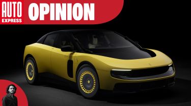
The Ferrari Luce has certainly generated a strong reaction. But now the dust has settled and the outrage is dying down, it’s time to decipher just why the Luce looks as it does. Many of my journalist colleagues have come into this industry with different background specialities, and mine is car design. And from my understanding, this is why the Luce looks as it does. For better or worse.
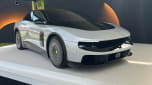
To start with, it’s important to reiterate that this was not the work of Ferrari’s usual design team in Italy. Instead, the company turned to a product design collective called LoveFrom created by ex-Apple men Sir Johnny Ive and Marc Newson. Car fans might not recognise the names, but these are two creative legends that sit right at the very pinnacle of the product design world. But product design is not car design – these are two very different vocations, and in this case the fathers of the minimalist post-PC product design era were just not the right people to reinterpret Ferrari in a futuristic context.
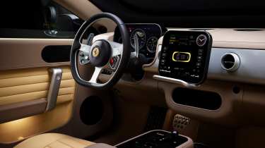
This is part of the reason the Ferrari Luce’s interior was far more widely accepted. A car’s cabin is a collection of different products – both technical and practical – that sit together in a simple ecosystem designed around a human being. The stunning detailing, integration of technical interfaces, and classical architectural elements such as the seats and consoles, are the bread and butter of both of these designers.
In my opinion, the Luce’s interior is a triumph: a clear and shining example of the sort of thinking that needs to be integrated into all car designs, and integrated now.
But the exterior design is a single kinetic object, not a product in the traditional sense. So while detailing and tactility are still relevant, there’s a different set of design fundamentals that are far more important, and they don't generally apply when it comes to product design. Proportions and a deep understanding of surfacing and volumes are what form the basis of good car design, and from the very beginning of this Luce program, these two things appear to have been left behind.
Don’t get me wrong, there are some interesting ideas here. The separation between coloured bodywork and the black inner glass is new and clever, and there’s no doubt the execution of such elements and how they intersect are as well executed as on any modern Apple product. Unfortunate colour correspondence aside, if this design language were applied to a Nissan Leaf, it would make perfect sense, but there’s no place for it on a car from Ferrari – of all manufacturers.
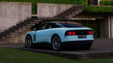
There’s no tension, no movement and no sense of speed. What do I mean by this? An example could be the front wheelarch bulge. If you were to draw a vertical line from the centre of the front wheels up to the body, the highest point of any curve in the bodywork should never intersect with that line; it should be slightly further back. This gives the impression that the car is moving, as if to ‘show’ the g-force. The Luce feels static and robust, but not speedy.
The same idea applies to the car’s general proportions. A short front and long rear overhang, typical of most ICE-powered GTs and sports cars, is not just the result of packaging in a large engine and making sure there’s a big boot, but it also offers that same sense of movement, as if the body is being left behind as the wheels drive forward.
The Luce’s tight overhangs on both axles give a very ‘BEV’ form, as you’ll see on all manner of bespoke electric cars from Mercedes to Hyundai, but it just doesn’t translate on premium or luxury products. If you’re wondering why a Mercedes EQS SUV looks a little too much like a mid-size people carrier from 2005, this is why. Jaguar’s Type 01, by contrast, doesn’t have any issues portraying the fact it’s a large and luxurious car, even if it has its own critics.
The Luce also has too much bodywork over the rear wheels – in fact, the car’s body is too tall in general – and the aero openings front and rear look ill-defined and blobby. The ‘inner’ body at the rear also accentuates the car’s excessive height, and even though this is a wide car, it looks narrow because your eyes almost tell you the outer skin isn’t really part of the car – it’s like a clumsy plastic case on an immaculate new iPhone.
From a personal perspective, I wanted the Ferrari Luce to succeed, and still want the design nous of people like Sir Johnny Ive and Mark Newson to radiate around the automotive design world and disrupt all the automotive design studios.
It’s not like Ferrari doesn’t need a snap back to reality too. The company’s Centro Stile in Maranello is still in need of a stronger design narrative across its cars, especially inside, and much to the delight of Flavio Manzoni, the current head of design at Ferrari, this mis-step might only make his current form language sit more comfortably in the short term. The Luce should not be lighting the way forwards for Ferrari design, even if the incredible tech and engineering underneath means that it really should.
Want the latest car news in your inbox? Sign up to the free Auto Express email newsletter...