Car badges: why are car logos becoming simpler?
In the last two and half years at least a dozen car companies have changed their badges from 3D to 2D. What’s going on?
Keen-eyed car enthusiasts – especially those that appreciate a good bonnet badge – may have noticed many car makers’ logos going two-dimensional of late.
Volkswagen can lay claim to being the first of the recent trend, switching to a flatter and simpler version of its famous encircled V and W letters back in autumn 2019 for the launch of the electric ID.3. But since then the floodgates have opened, with BMW, Nissan, Toyota, Rolls-Royce, Vauxhall, Kia, General Motors, Dacia, MINI, Peugeot, Renault and Volvo all unveiling 2D versions of their previously 3D badges.

The 3D-to-2D logo trend isn’t really about fashion, it’s first and foremost about technology and functionality. In simple terms, three-dimensional logos aren’t as easy to view or display in the greater variety of formats required to sell cars in the current era, from apps on small smartphone screens to website or showroom configurators. But beyond these practical considerations there are also more subtle reasons why badges are changing from fuller 3D to flatter 2D.
A bigger trend that predates the recent 2D car logo rush is the number of car makers wanting to transform into ‘mobility providers’. As eco legislation and taxation aim to restrict private car ownership to reduce congestion, subscription and pay-as-you-go electric car-sharing and delivery services controlled via apps are expected to increase – and a few car makers have already set up separate mobility divisions, such as Toyota’s Kinto and Renault’s Mobilize brands.
Logically, such repositioning makes visual references to a firm’s mechanical history less relevant. Early in 2021 Kia even dropped the word ‘Motors’ from its name as its badge turned 2D. The signs of this different design tack have been evident in other industries for a while.
Making car badges appear metallic and chunky when they’re actually painted plastic and pretty flimsy – usually for cost and crash-safety reasons – is a bit ‘2007 Apple iPhone Mk1’. Back then the iPhone’s Notepad app sported digital-effect beige paper and a margin line to reassure users of physical notepads that it was also a good place to write information.
Apple dropped that approach long ago, and in a similar way maybe car badges no longer need to look like they’re made of metal to convince buyers that their increasingly electric and digital cars can be trusted.
There’s a symbolism to big, 3D metallic-looking badges, which might be out of step with often trying modern times too – from recession to pandemic – that has made some humans try to appear less self-centred. The ‘look at me’ shiny and bold trend in design, colour and materials has been making way for satin, matt and subtle finishes for some time in everything from exterior car window surrounds to interior knobs and switches.
For VW specifically, the new, more humble logo for its electric ID range could be seen as symbolic of distancing the brand from its Dieselgate scandal of late 2015. “The old logo was a bit too jewel-like and not so much Volkswagen anymore,” head of design for VW Group Klaus Zyciora says. “We reconsidered the aim of VW – democratisation of mobility, accessible products and environmentally friendly mobility for all. The new design is a step back to what we have meant to people over the decades.”
Even Rolls-Royce is seeing shifts in its wealthy customers’ buying habits. “We found that Ghost clients rejected busy details and flash gimmicks,” Rolls-Royce designer Henry Cloke says, “instead seeking high quality, thoughtfully designed pieces that stand up to intense scrutiny.” As with other car makers, the British brand is also repositioning itself, not as a mobility provider but as a ‘House of Luxury’, as it looks to sell upmarket services and quality accessories, as well as cars.
Despite this shift in car logo style, most designs have changed little. Dacia is an exception, with its old badge – like so many others of the early 2000s with its name sat within a generic shield – changing in 2021 to just the word ‘Dacia’ or its ‘DC’ initials, both rendered in a bold and simple typeface, just like its no-nonsense cars.
But then Dacia has less history to consider. Car makers with 100-plus years of brand awareness would be daft to throw it all away. Start-ups from the US and China don’t have old logos associated with soon-to-be banned technology, but they also lack the hard-won, long-held and often nostalgic reputations of traditional makers built up over generations. So while plenty of other car makers will likely soon switch to 2D logos, expect their historic brand identities to stay largely familiar.
The history behind 8 familiar motoring logos
Most car brands are instantly familiar, whether it’s the three-pointed star of Mercedes or Toyota’s approximation of a ‘T’. The logo plays a bit part in this, because it’s mounted on every car that comes out of a manufacturer’s factory, in a bid to create a brand identity that will leave a lasting imprint on potential customers.
But while the car badges have become more refined and modernised over time, they remain steeped in history. So what are the stories behind the badges – why does Audi have four entwined rings, Peugeot a lion and Vauxhall a griffin? We delved into the past to find out...
Porsche
Established: 1948
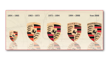
The Porsche badge was first conceived in 1952, before appearing on the 356 in 1954. Stylised antlers and the state colours of red and black all echoed the crest of Württemberg-Baden, the area around Stuttgart in Germany where the company was based. Meanwhile, the black steed features on Stuttgart’s coat of arms and emphasised Porsche's bond with the city.

It also expressed the power of the cars Porsche would become famed for. The Porsche badge is one of the few to have barely changed over the years, with the exception of slightly trimmed lettering and a smoothing over of the horse’s contours.
Mercedes-Benz
Established: 1926
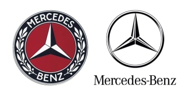
The Mercedes-Benz three-pointed star was trademarked in 1925, just in time for the 1926 merger between DMG (Daimler) and Benz & Cie, which created the brand as we know it.
The star symbolises the use of Daimler engines on land, at sea and in the air, and was combined with Benz’s laurel wreath on early logos.

In 1933, the first form of the modern logo was created – a black circlet with the silhouette of the Mercedes star inside. The star, laurel wreath and lettering were dropped in favour of the star alone in the nineties.
Renault
Established: 1898
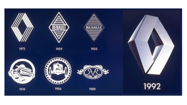
When the Renault logo was first designed in 1900, it consisted of the intertwined initials of the Renault brothers Louis, Marcel and Fernand. The badge was initially a roundel on the front of the car, which was cut out as the horn was placed behind it and sound needed to escape.

It went through many transformations before evolving into a diamond in 1925. Since then it’s been developed into the 3D badge we now know. The yellow that is widely associated with the brand was first incorporated into the design in 1946, when the company was nationalised in France.
Renault is set to introduce a reinterpretation of the diamond badge it used throughout the 1970s and 1980s. In the next couple of years, the French brand will start selling an electric Renault 5 with styling based on the original.
Audi
Established: 1899
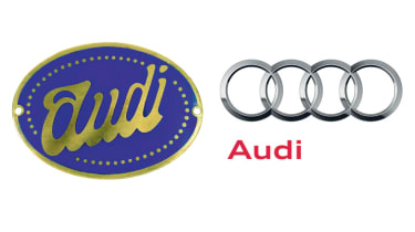
Each of Audi’s four interlinked rings symbolise one of the four previously independent manufacturers – Audi, DKW, horch and Wanderer – that merged to create the present-day Audi AG.
The interlinked rings represent the unity of these four founder companies, while each of the four brands was assigned a specific market segment within the group.

DKW assumed responsibility for motorcycles and small cars; Wanderer built mid-size cars; Audi made cars in the deluxe mid-size class, and Horch produced deluxe top-of-the-range models.
The whole group became Audi, but its current VW Group ownership means it’s pretty much in the same position. It’s joined by Skoda, the group’s value arm, SEAT for style, VW and companies like Porsche and Bentley creating the real luxury products.
Vauxhall
Established: 1903
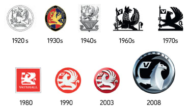
The Vauxhall griffin was first used on the coat of arms of Fulks le Breant, a mercenary soldier who was granted the Manor of Luton by King John in the 13th century and was given a house in Lambeth, London. he named the building Fulks Hall, and over time, the name was corrupted into ‘Vauxhall’.
Vauxhall Ironworks later adopted the griffin in 1857 as its logo, and in 1903 kept it when it became the motor company that we now know.
Peugeot
Established: 1887
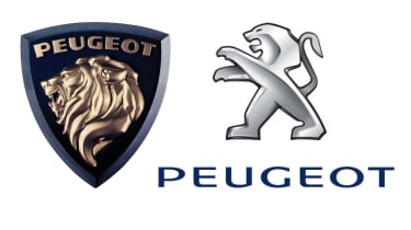
The Peugeot lion has gone through several dramatic makeovers in its lifetime. Back in 1847, when Peugeot produced saw blades and other tools, the lion was chosen as the logo to reflect the strength and suppleness of its saws.

Various versions of a gilt lion were eventually replaced by a new generation of the logo – the lion in outline arrived with the 604 in 1975. It has changed little since then, evolving into a more fluid design.
Like Renault, Peugeot has recently introduced a retro-themed brand-new badge that echoes the left-hand image above. It’s a black shield with a silver lion head and Peugeot lettering above it, and it’s meant to create a more premium image as Peugeot looks to head upmarket.
Citroen
Established: 1919
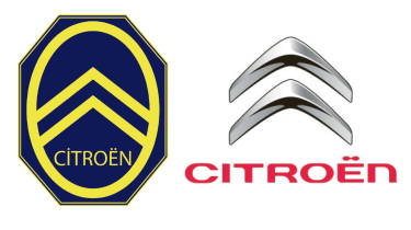
On a trip to Poland in 1890, Andre Citroen discovered a gear-cutting process that was based on a chevron-shaped design. Citroen saw this as the means to start his career in manufacturing, so in 1919, when he began making vehicles, he adopted the double chevron as his logo.

Of course, over the intervening years, it has seen many changes, but it wasn’t until the eighties that the blue and yellow scheme was dropped in favour of white and red for a more dynamic appearance.
Skoda
Established: 1895
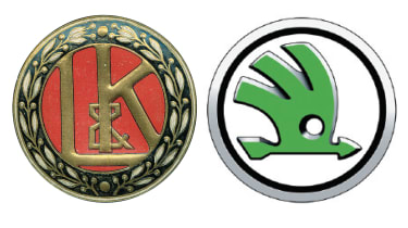
The Skoda name didn’t appear until 1926 – around 30 years after the company was born (it was originally called Laurin and Klement after the founders). With it came the modern logo.

The origins of the winged arrow are unknown, although rumours suggest the circle represents the globe, the wing technical progress and the arrow advanced production methods. Alternatively, it’s rumoured that it could resemble an Indian headdress. It wasn’t until 1995 that the badge was given its current colour scheme, with black to celebrate its 100-year anniversary and green to show its commitment to being environmentally friendly. Skoda unveiled its latest badge in 2016.
Which is your favourite car badge of all time? Tell us in the comments below...